Dear moderator,
Welcome to my blog, I hope you like it!
To find my research and planning evidence, please click on the AS Research and Planning label which is on the top right hand side of my blog.
I hope you enjoy it :)
Thank you
Sophia 3067
This blog is now closed.
Sophia's Blog (3067)
My name is Sophia (3067) and this is my Media blog. Hope you like it!
Wednesday, December 12, 2018
Saturday, December 8, 2018
Post 21: My Finished Adverts
I am happy that my adverts turned out really well; my brand conveys its message of bringing people closer together. This is shown by the contrast between the beginning of the adverts where the actors feel upset and awkward, and the end of the advert where everyone is happy together because of the food. The phone app shown at the end of both adverts is a typical convention of food delivery service adverts and shows the audience how easy it is to download the app and order.
Making these adverts was really tough as we were on a tight schedule with many deadlines. With the help of our teacher and the technician, the process was made much easier. I worked hard to make sure I included as many conventions as I could in my research and in my adverts to fulfil the brief. I’m excited to have finished my adverts and my blog posts, and can’t wait to start my next media project!
Friday, December 7, 2018
Post 20: My Target Audience Feedback
I did this to find out what my target audience thought about my adverts and how effective my advert is in persauding them to switch to YourFood. I did this by creating a survey asking several questions to four different people.
From this research I have learnt that both my adverts were successfully conveying the narrative and portraying my brand message of yourFood bringing people closer together. From my feedback, I saw that both Sylvie and Lim thought my adverts were 'dynamic' and had 'fantastic cinematography". Another similarity was that all my participants were highly likely to order from Yourfood, rating that choice between 8-10. Next time, I would try to include someone with a disability as, not only would it be a more accurate representation of society, but it would appeal to an even wider audience.
- Can you please describe both problems and both resolutions in each advert?
- Did you lie both adverts? If so, what aspects did you particularly likfe? And if not, what could be improved?
- On a scale of 1 to 10 how likely you are to order from YourFood? (1 being not at all, 10 being 110%)
- Any other feedback?
I asked four people to take part in my survey:
- Sylvie, aged 20 (family friend)
- Hugo, aged 16 (class mate)
- Christina, aged 24 (neighbour)
- Lim, aged 17 (class mate)
| Feedback from Sylvie, aged 20 |
 |
| Feedback from Hugo, aged 16 |
 |
| Feedback from Christina, aged 24 |
 |
| Feedback from Lim, aged 17 |
Thursday, December 6, 2018
Post 19: My Advert's Review
I created a 'review' copy so that I was able to see how my advert looked on a big screen. I did this by making my adverts the best that they could be and uploading them onto YouTube.
This allowed me to receive feedback from my peers and the media staff so that I could notice things I didn't before. After the review I noticed that my grading was a bit to saturated and some shots were too bright. I changed it by reducing the saturation and lowering the contrast on certain shots. It was particularly difficult with outside shots as if the brightness was too low, it didn't match the rest of the shots, but if it was too high, the sky was a sharp white colour. I used a tool on 'ThreeWayColour Correction' which lowered the sharpness of white areas without affecting the rest of the shot.
Post 18: My Rough Cut
Creating a rough cut for each of my adverts allowed me to see if my shots could be improved when they were put together. I did this by cutting each shot and placing them in order on PremierPro.
This benefited me as I was able to see that certain shots weren't continuous when they were placed in order. From the rough cuts, I could see the lighting changed drastically between some shots, and that some camera angles weren't right. All these little things I noticed allowed me to create a new and improved second storyboard for my backup weekend shoot. It also gave me an idea of how long each advert was (around 40 seconds for both adverts in the beginning).
Post 17: My Shoot-Board
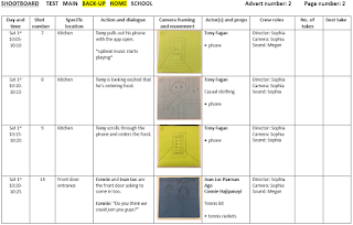
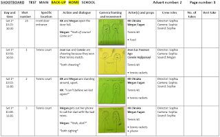
I created a shootboard for my weekend shooting, as it helped me work out which order to film my shots. I did this by using a template graph and taking a picture of each of my shots and placing them accordingly by location. I had to create a second shootboard as I was using my backup shoot the following weekend. I did this by only taking pictures of the shots I was reshooting that weekend.
 |
| 1st weekend shootboard page 1 |
 |
| 1st weekend shootboard page 2 |
 |
| 1st weekend shootboard page 3 |
 |
| 1st weekend shootboard page 4 |
 |
| 1st weekend shootboard page 5 |
 |
| 1st weekend shootboard page 6 |
 |
| 1st weekend shootboard page 7 |
 |
| 1st weekend shootboard page 8 |
 |
| 2nd weekend shootboard page 1 |
 |
| 2nd weekend shootboard page 2 |
 |
| 2nd weekend shootboard page 3 |
 |
| 2nd weekend shootboard page 4 |
This process benefited me as it made it easier to know what shots to film in that specific location at one time. This limited the number of times I moved the camera about and reduced the risk of an accident - for example tripping over the headphone cable. By making a second shootboard, I knew what shots I was retaking and I didnt get confused with the shots I had already taken on my previous shootboard.
Post 16: My Kit List
A kit list was important because we could check whether we had every part of the kit on the weekend. This also made sure that our partner had all items of the kit for when they filmed.
 |
| Kit contract |
 |
| Kit checklist |
 |
| Equipment release |
Having the list benefited me as I filmed in two separate locations, so I avoided forgetting any equipment which would've delayed my filming. Shooting all my shots during the day was essential to my advert so having the list made me more time efficient.
Subscribe to:
Comments (Atom)
